

To allow for easy detection of problematic groups of clusters in big data sets with disparate customer or trader cluster volumes, the Outlier Chart displays the percentage of high-risk clusters within a group’s total clusters.
Outlier Chart display
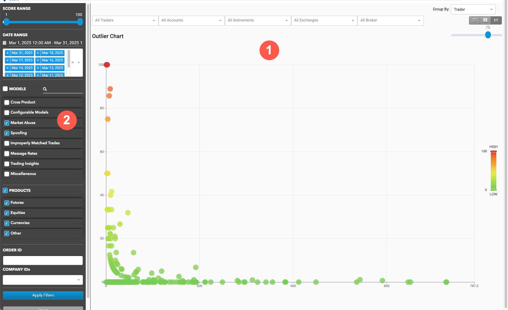
The Outlier Chart display is organized into the following sections:
- Outlier Chart: Displays the Outlier view of the loaded data as well as filtering and navigation tools.
- Data Selection Panel: Manages the dates available to TT Trade Surveillance and specifies the criteria to use when populating the list.
Interpreting the Outlier Chart
The Outlier Chart displays every entity’s percentage of clusters with a score above a threshold defined by the user. The default score threshold is set to 75.
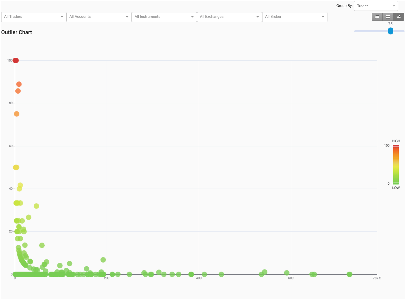
- The color of the dot indicates the severity of the score, with low scores represented as dark green and becoming yellow and finally dark red as risk scores increase.
- The position of a dot in the X-axis indicates the number of clusters contained in the dot.
- The position of a dot in the Y-axis indicates the percentage of clusters that exceeded the score.
Outlier Chart navigation and filters
Navigation and filters are located above the Outlier Chart.

- Select View: Switch between Individual Clusters, Heat Map, and Outlier Chart views.
- Group By: Sort the view by trader, account, and instrument.
- Outlier threshold: Set the minimum score to consider as high risk.
- Cluster Filters: Filter the view by trader, account, instrument, exchange, and broker.
Data Selection Panel
On the left of the screen, the Data Selection Panel shows the daily activity logs that have been selected using the date picker and are available for data visualization. It also includes filters to apply to the data view.
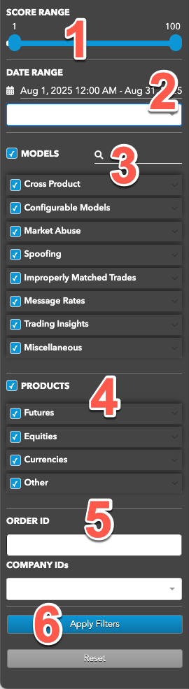
The panel includes the following:
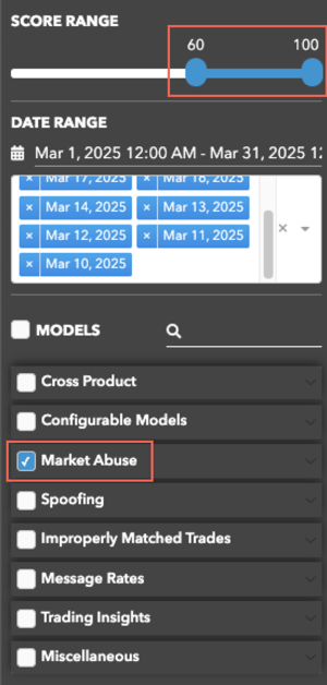
- Score Range: Sets the maximum score of the clusters to include in each view.
- Date Range: Date-based selector to add daily activity data to analyze.
- MODELS: Sets which types of suspect trading patterns to analyze in the data. Check this checkbox to apply all problematic trading models. TT Trade Surveillance uses the following models to analyze data for problematic trading patterns:
- Abusive Messaging: Quote stuffing schemes designed to introduce predictable latency into an exchange’s quoting engine or malfunctioning algorithms that might cause market disruptions.
- Automated Collusive Spoofing: Patterns of manipulative or disruptive trading activity by multiple traders working together to automatically submit a number of orders for which they have no intention of executing in an attempt to move the market.
- Automated Spoofing: Patterns of manipulative or disruptive trading activity that involve the automated placement of a number of orders for which a trader has no intention of executing in an attempt to move the market.
- Collusive Spoofing: Patterns of manipulative or disruptive trading activity by multiple traders working together to place a number of orders for which they have no intention of executing in an attempt to move the market.
- Configurable Models: In addition to core models, TT Trade Surveillance offers configurable models that allow you to create models to generate alerts when activity matches the specified parameters.
- Cross Products: Patterns of suspicious trader behavior across instruments, products and markets. The clusters identify activity between multiple traders across different configured products.
- Cross Trading: A cross trade occurs when a buy order and a sell order for the same instrument are entered for different accounts under the same management, such as a broker or portfolio manager.
- Exchange Messaging Rate Limits: Instances where traders exceeded the exchange message rate limit for a set period of time during a trading session.
- Influencing the Open: Instances where indirect wash trades occurred at the open of trading in violation of exchange rules.
- Marking the Close: Trading activity intended to manipulate the settlement price of an instrument during its settlement period.
- Momentum Ignition: Behaviors that indicate an attempt to create an artificial price movement with aggressive orders followed by an attempt to capitalize on such movement.
- Pinging: The entry of multiple small orders intended to discover hidden book depth followed by a series of order actions designed to force the large order to trade at less desirable prices.
- Price Ramping: Behavior that may be an attempt to create artificial price movement with aggressive orders.
- Spoofing: Patterns of manipulative or disruptive trading activity that involve the placement of a number of orders for which a trader has no intention of executing in an attempt to move the market.
- Wash Account: The same account ID is both the buyer and seller in the same transaction.
- Wash Trader: The same trader ID is both the buyer and seller in the same transaction.
- Dominance at Open: A single trader’s orders make up the majority of the disclosed market volume of an instrument during the first 15 minutes of the current trading session.
- Order Book Dominance: A single trader’s working orders make up the majority of the disclosed market volume of an instrument at any time during a trading session.
- Products: Sets one or more of the following product types to include in each view:
- Bond
- Common Stock
- Cryptocurrencies
- Index
- Options
- Outrights
- Spreads
- Unknown
- ORDER ID — Allows you to search for clusters using an order ID.
- Apply Filters: Applies the selected dates and filters.
Visible models in the Data Selection Panel
The TT Trade Surveillance Dashboard settings in the Preferences | Models Defaults – Visibility & Range section determine which models are visible in the panel and what range of cluster scores are included in the cluster data views.
When you click the Surveillance tab to show the Data Selection Panel, the MODELS section is filtered based on your visibility preferences. By default, all checkboxes are checked for the visible models and the SCORE RANGE is 1-100.
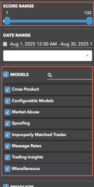
As you check each visible model, the SCORE RANGE displays the range preference set for the selected model (e.g., 60-100).