Charts
Adding a series
The Add Series feature lets you compare multiple instruments on the same chart. A series uses a line chart, along with an independent price axis, for each instrument in the series. You can add up to two more instruments to the base instrument's chart. You might use a series to compare different instruments that you think might related in some way, such as consecutive expiries of a single instrument or multiple instruments for related products. For example, the following chart uses the Add Series feature to display the activity for the Jun18, Jul18, and Aug18 BRN (Brent Crude) instruments.
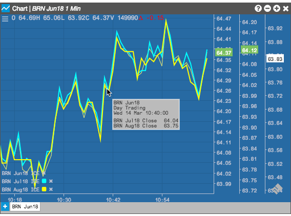
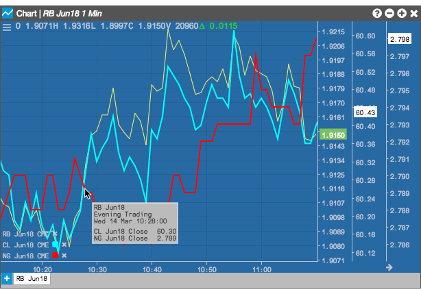
In addition to the visual cues shown in a series, hovering over any curve also displays information about all of the line charts that intersect at the point.
Note: Series support only the Line chart type.
To add a series to a chart:
-
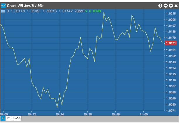
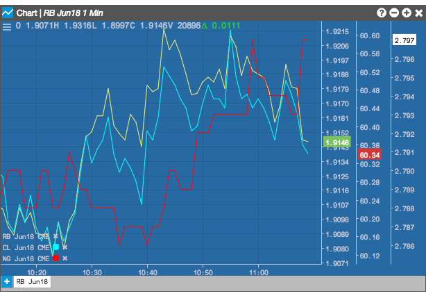
Open a chart with the base instrument, using a Line chart type. In this case, we will display the price relationship between crude (CL Jun18), natural gas (NG Jun18) and RBOB gas (RB Jun18).
-
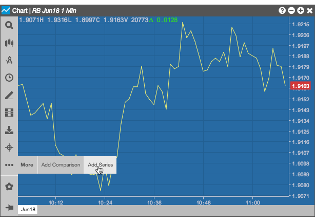
From the Chart menu, click
 and select Add Series.
-
Use Search to select the next instrument to add to the chart.
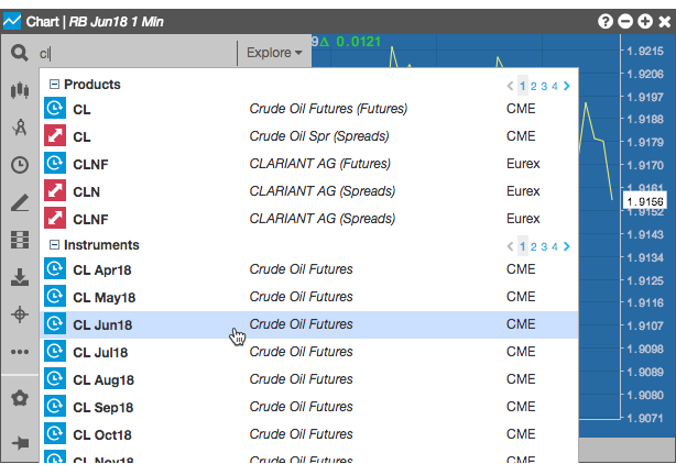
A line chart and price axis are added to the chart for the selected insrument, and its name and color are added to the legend in the lower-left section of the chart.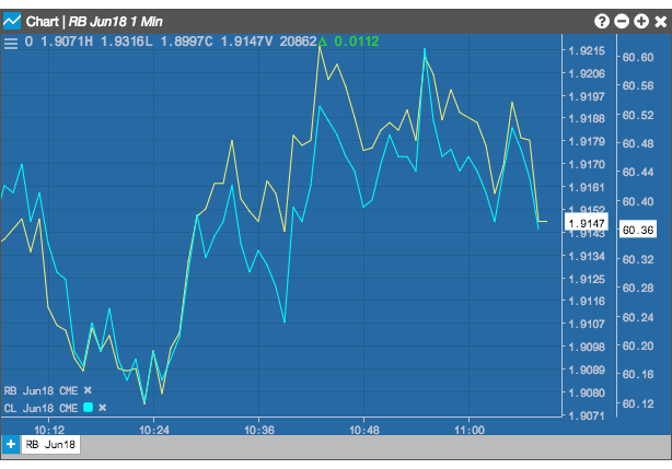
-
If desired, use the same process to add the last series.
-
Hover over a point where the two or more curves intersect to show the price for each series at that point in time.
To remove a series from the chart, click the delete icon following the instrument's name in the chart's legend.